Wednesday, September 25, 2013

My Illustration Workshop on Iona - Inkery on the Island!


It's true, I have years of experience as a lecturer (Edinburgh College of Art and several other educational establishments too) but I have never hosted a residential Illustration workshop!
 Well, it's about time that changed and I was finally convinced to go for it (with a bit of friendly persuasion and encouragement from the book artist Rachel Hazell, no less).

So,  I am delighted to tell you about my first ever residential workshop called Inkery on the Island which is taking place on the magical island of Iona, off the west coast of Scotland, from 6-10th March next year! Exciting, isn't it?

My workshop is about discovering new ways to respond to words, developing ideas for visual narratives and learning to trust the creative gut instinct...as well as experimenting with ink and dip pens!
Creating finished illustrations based upon unexpected forms of text is the goal - Ink, drawing, paper, looking, thinking, ideas, words, random elements and playfulness will ALL be involved in that process, that's for sure! There will probably be wine and biscuits too. And cake.


 It's open to anyone who likes to dabble in art in its many forms and who simply fancies stepping outside their everyday work and doing something a little different! You don't have to be a professional artist /illustrator/designer/maker but if you ARE , then you are very welcome too. View it as a chance to re-boot, especially if you need a bit of space and perspective to reflect on what and where your creative practice is heading. And yes, ideal for anyone who needs to re-engage with their playful, most creative side!


There are 8 places available on this 3 days /4 nights workshop, which costs £400.00 per person inclusive of tuition, accommodation, food and basic materials...and bags of creative inspiration (and of course there will be a goodie bag too)! We'll have the exceptional, super-comfy award- winning Iona Hostel as our exclusive base - there really is no better place to experience this beautiful island. Arrange your own travel to Iona which is actually quite easy to get to both via car/ferry and by efficient public transport links - and the journey is all part of the fun.

This will be, I hope, a truly fun, inspiring and creative break. If you are interested and want to know more information, discuss whether it's right for you or just fancy a blether please contact me on jill@jillcalder.com or call 01333 313737 for an information sheet.

Now for something joyously inky, inspired by my travels to the glorious West Coast of Scotland. Who knows, maybe you'll see a wild otter too, if you come to Iona!


Monday, June 03, 2013

East Neuk Open Studios in June

"Jungle Bus" by Jill Calder © 2013
It's that Open Studios time of year again! Yes, I'll be flinging open my doors in Cellardyke on June 8-9th and June 15-16th as part of East Neuk Open Studios, so please do come and visit me!
Download a brochure and check out the artist locator Google map on the ENOS website

New on show this year will be a selection of prints from my Children's Sleep and Ventilation Unit "Amazing Dream" project at the Royal Brompton Hospital in London - signed and numbered, of course!  "Jungle Bus" is part of this series and was inspired by a little boy in the Unit who had Cystic Fibrosis and dreamed of going on a night adventure with his toy monkey, Freddie.
20% of the sale price will be donated to the wonderful Royal Brompton & Harefield Hospital Charity 
Nurse Station in the Children's Sleep & Ventilation Unit with some of my artwork installed.
This charity, which helped fund the workshops and large scale artwork I created for the Children's Sleep and Ventilation Unit,  tirelessly raises money to support the outstanding work that takes place at the Royal Brompton and Harefield Hospitals by buying equipment, funding vital research and improving the lives of patients – all in areas where the NHS simply could not supply the extra funding needed. 

Other prints and cards will be on show in my working studio, so head on over to Fife - it will be lovely to see you!


Tuesday, April 16, 2013

Sunday Times Magazine - Art on Sunday


The Sunday Times Magazine has a had a wee bit of a make-over recently and they have a new feature called Art On Sunday. It's a pretty tiny spot but it does *ping* out of a page of Witter interviews and other written features. I was asked by them to illustrate the theme of "Sunday".
Out came my beloved Pentel Japanese Color brush pen and a slightly more muted and cosy colour palette. Dogs are a big part of my life, especially at the weekend so they had to feature. My husband cooks the BEST roast and roast tatties, Yorkshire puds and gravy ever and when it is on the table, the dogs circle like polite sharks. Birdwatching...well, I confess, since I moved to the countryside I seem to notice birds and wildlife a lot more than when I was in the city (but I don't own a pair of binoculors...yet). Don't ask me where the idea for the Birdwatcher came from - usually just the act of drawing gives me a chain of ideas - but I like that it made me laugh...and in my head the dog is just on the point of tapping Mr Twitcher on the shoulder to say "You do realise...?"

Just another Sunday. With a moody heron.

Friday, February 15, 2013

Little Black Book of Seafood


This was a dream illustration and lettering job that first landed on my desk almost a year ago, took a while to get going, then BAM! - it's everywhere now! Here's the story:


 The lovely and sassy team at The Leith (an Ad agency in Edinburgh who I have worked with many times before) got in touch to say their client, First Great Western, were collaborating with award winning chef Mitch Tonks to produce a guide to the best seafood restaurants, cafés and fish and chip bars in the South west of Britain...and would I like to illustrate it? Why, yes I would, thank you very much.

 Now, I love my seafood, love cooking seafood and I live in a fishing village so I felt very at home with this project - I just needed to look out my window for inspiration: Crab and lobster creels all stacked up, blokes fishing on Cellardyke Harbour (catching pollock), the prawn boats from Pittenweem out in all weather and the haddock on my plate at the Anstruther Fish Bar, served with a mug of strong tea.

I adore drawing foodie things and on this project I got a pretty free reign to produce imagery, maps, lettering and also a selection of wee line spot illustrations for the book. Heaven.
sketches... crammed in like sardines

As an added bonus, the book was animated for online viewing and you can see the whole thing HERE

Of course, First Great Western are promoting the book to inspire people to travel to Devon, Dorset, Cornwall and South Wales, explore the region and discover some fishy foodie gems tucked away down there in the Southwest. A culinary pilgrimage, if you like...with sporks.


Little Black Book of Seafood was launched at Paddington Station in London, where Mitch and fellow chef, Mark Hix created a pop-up dining room, offered oysters and fizz to rush hour commuters and had a good chat about how great the quality and range of seafood on offer in the Southwest is!
What I really like is that all proceeds from the sale of the book ( it costs £1.50) are donated to The Fishermen's Mission, a charity dedicated to helping the lives of fishermen and their families.


Enjoy the book and if you love a little bit of fishy in your dishy then please take a moment to donate to the Fishermen's Mission here
 Now, someone pass the tartare sauce, my chips are getting cold!


Saturday, January 12, 2013

Slàinte mhath! • [ slanj'-uh va' ]

...or, Benromach Single Malt Whisky ( no"e") and Me

Neil, David and Richard Urquhart of Gordon & MacPhail toasting Keith and Mike!
On a cold winter's day last year I was contacted by renaissance man Doug Alexander at Stuff Creative and asked if I fancied getting involved in a bit of branding for a small, exclusive single malt Scotch whisky distillery called Benromach.
Now, I have been involved with port, vodka and beer campaigns before but never a Scotch whisky, so of course I said YES. I am a Scottish illustrator after all and it's our national drink...I'd be daft not to!

Benromach, founded in 1898, is the smallest distillery in Speyside. 30 years ago the brand very nearly went extinct when the distillery was closed down. Rescue came from Elgin based bottlers and distillers Gordon & MacPhail who took it on and overhauled the  distillery buildings and stills in Forres and the distillery was finally officially reopened by HRH Prince Charles in 1998.
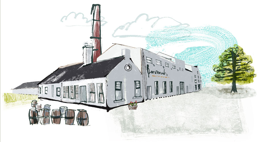
my illustration of the Benromach Distillery

Today just two ordinary (yet extraordinary), local blokes distill the Benromach whisky - no computers, no drama, nada. Just Keith and Mike, making lovely award winning water of life.
And it is this message that Stuff Creative and Gordon & MacPhail really wanted to tell people about the Benromach whisky:  that it's home made and hand crafted.
David Urquhart, Joint Managing Director of Gordon & MacPhail, the family-run Elgin company which owns Benromach commented: “Benromach is a handmade, boutique whisky which is lovingly crafted by Keith and Mike. They are the essence of Benromach and so we thought it appropriate that they were placed front and centre of our new concept."

Keith and Mike, with the whisky stills behind them.

 My illustration and lettering style and my way of working really chimed with this branding message and so I travelled up to the distillery in the north of Scotland one snowy day to meet Keith and Mike, have a blether, a few tastings and get shown around...and do some drawings of them in their place of work. What a pleasure!


I came away with lots of rum tales ( the distillery is haunted by a cat, apparently) and a great impression of how to portray them both in the illustrations I had been invited to do. How lovely to actually meet and talk to the subject of my illustrations face to face. Yes, I could have Googled them but my heading north really made a difference, I think, to the feel of the final illustrations.
The project continues - an animated film, and even a book have been discussed!
Whisky without an "e" is big business for Scotland right now... Benromach have just reported that their global sales increased by 40% in 2012 and exports increased by 55%. I like to think that my illustrations had a small part to play in that success!

Meanwhile, my illustrations of Keith and Mike now appear internationally on huge trade show and food festival backdrops and banners, in advertising spreads, on posters and even as life size cardboard cut outs that people have their photo taken with, dram in hand, toasting them with the traditional Scots Gaelic, Slàinte mhath! - pronounced slanj'-uh va' - meaning Good Health!

Keith at the Benromach stand at the Royal Highland Show 2012

Tuesday, December 18, 2012

Have a Cosy Christmas!


Hello lovely people! Here's hoping you have all (unlike me) done your shopping, wrapped your presents, hummed a carol, stashed your mince pies and cracked open the sherry already. No? Well, you still have a few frenzied days yet!

I am currently rushed off my feet with Christmas commissions, which is great but it does mean I have to think/plan/act like an SAS crack troop in order to get all my other Christmassy tasks completed too.

Needless to say, I have started the epic task of updating, refreshing and generally spring cleaning my website, which was certainly needing the cobwebs blowing from it! I have new plans for it for the New Year, so do keep popping by to see what's new.

In the meantime, enjoy this little snowy mountain cabin and please have a lovely, joyful and cheerful festive break...and do give a little thought to those who may not be having such a happy time too.

Saturday, October 06, 2012

Queen Kook: Portrait of a Bohemian Blue-Blood

Kook is the latest portrait in my on-going series of glamorous  illustrations which I rather bizarrely entitle "The Hair Girls". This series, which also includes Frisco and USAville, is inspired by my increasing appreciation of portraiture, as well as fabulous fashion photographs in Vogue, Harpers Bazaar etc. I adore a good fashion moment, me... and this series lets me play and experiment with fashion illustration. 
So, with Kook I really wanted to draw something different, using a more muted palette and rich handmade textures as well as try out a new style of lettering... cue research trip!
In particular, I got lots of ideas from my many visits to the wonderful National Portrait Gallery in London - specifically the Elizabethan and Tudor rooms - and also the National Galleries of Scotland in Edinburgh too. I have become fascinated by portraits from the 16th-19th Century of royalty and nobility as they are so embellished, bling-bling and loaded with symbolism yet still so formal and rigid in the way the sitter is posed.
© The National Gallery
 Quite often the painter of these portraits was an "unknown artist", often Flemish or Dutch. However, Hans Holbein is the artist most associated with painting the Tudor nobility - King Henry VIII, in particular. Holbein's portrait of A Lady with a Squirrel and a Starling, painted around 1526 is one of my favourites from this period. It has a simplicity and freshness to it that makes it stand out from other portraits of the time. Apparently it may have been one half of a marriage portrait - what did her husband look like? What did he wear? What animal was he posing with? I'd like to see that portrait too.
When I was wee, I was fascinated with the story of Mary, Queen of Scots, especially as she had her head cut off ! Here she is depicted (with her head) on her tomb in Westminster Abbey in all her pious and mournful beauty.
tomb of Mary Stuart, Queen of Scots at Westminster Abbey

 Last but not least, the whimsical work of Guiseppe Archimboldo is an inspiration for Kook too - this particular picture, Spring, painted in 1563 being a favourite. Isn't it lovely? He literally has rosy cheeks!


If you fancy a bit of blue-blooded nobility adorning your walls, Kook is available as a signed and numbered print!

Tuesday, June 12, 2012

2012 East Neuk Open Studios


East Neuk Open Studios - June 16-17 and 23-24. 10.30am to 6.30pm

I have done tonnes of new work especially for ENOS this year! The above print, "Lion Food" is a new member of my popular "Not Cute" animal series.  It is a 50x70cm digital print on 310gsm Studio Contour paper and beautifully framed in black...or you can just buy it unframed if you prefer!

Please come along and visit my studio for a chat, see work in progress and look at all my other new work. Be sure to drop in on all the many other artists and designers that live and work in this bonnie part of Scotland!

ENOS website and brochure download HERE
Follow us on Twitter too @eastneukopenstudios

#ENOS2012
#eastneukart

Thursday, February 23, 2012

NEW PRINTS!


Amongst all the jobs and workshop planning, I have been trying to get some new prints done. I sell my work through two galleries, Funky Scottish and The Outbye Gallery, as well as during East Neuk Open Studios and it is about time I made some lovely new work to hang on their walls!
So, I am expanding the ongoing series of large, animal themed prints which I call "Not Cute", which so far comprises of Baboon & Owl, Like a Rabbit in Headlights, Forest Deer, Urban Fox, Hibernacula Woods and Bird Puddles (I may have missed a couple out...). New Not Cute prints will include lions, otters, horses, fish, more birds and possibly a dog. The lion print is looking seriously good, I have to admit :-) I'll post it when it is completed.

BUT...I do love my fashion-y, girly-wirly illustrations and so am adding to that series too (which I  call "Hair Girls" for some bizarre reason). The above image ,called Frisco, is one of 3 new prints in that series.
Image area is 28x28cm and with a nice crisp mount will measure 50x50cm, perfect for ready made frames from Ikea etc. Of course, if you prefer a bigger version and want it custom framed, then we can talk about that too!

Wednesday, February 15, 2012

The Theatre/Theater, dahling!


New York City? Iconic skyline? Wooden water towers?  Flyers swirling in the Midtown breeze? Girl in cute little ankle boots picking one up? Yes, all elements in a new illustration I was commissioned to do by John Smart at Collaborate  for the lovely Green Room Musical Theatre Company.
As you can see from the website, I also did the artwork for a previous production called "The Last Five Years", as well as draw portraits of all the company members. 

THIS production is called "Ordinary Days" by Adam Gwon and here's what it's all about:
"Adam Gwon's Ordinary Days is a refreshingly honest and funny musical about making real connections in the city that never sleeps (but probably should at some point). It tells the story of four young New Yorkers whose lives intersect as they search for fulfillment, happiness and love.
This is an original musical for anyone who's ever struggled to appreciate the simple things in a complex place.  With equal doses of humor and poignancy, it celebrates how 8.3 million individual stories combine in unexpected ways to make New York City such a unique and extraordinary home."

Style-wise, I am trying a few things out at the moment and a projects like this is a great opportunity to experiment a bit, as the designer and the client are both open to my doing that and positively encourage it - love that! I love my ink but am really obsessed with texture and surface pattern at the moment, as well as a kind of printed/collaged aesthetic (does that make sense?) The girl is drawn with ink but the building and flyers are "drawn" with the lasso tool in Photoshop, selected from files of hand-made pattern and texture that I create and keep a database of. Sometimes I find a fabric or bit of old monoprint lurking in my plans chest (yes, the Tardis one!)  and just scan it in and keep on tap. Using the Wacom pen to draw with the lasso tool feels very natural to me, and I don't consider it to be any different from drawing with a dip pen. My line still comes through - though you lot can be the judge of that!

 The Ordinary Days tour continues at the Scottish Storytelling Centre, Thursday 21 June 2012, 7.30pm - contact Michael at Green Room about tickets!

Thursday, January 05, 2012

All The Things I Should Have Blogged About But Didn't

No blog post since August is pretty shoddy, I'll admit -  but there have been a few good reasons for my focus to be elsewhere. First and foremost is that my sister very nearly popped her clogs in September but is on the mend slowly but surely, thank goodness!  Family commitments became a priority whilst still keeping understanding clients happy and so self promotion, studio sort-outs and blogging/tweeting were put on the back burner.
However, some great projects and events have still happened between August and now, so I thought it might be better late than never to write about them in one epic post. So, gird your hirdies, pop the kettle on for a brew then hunker down because you may be some time getting through this beast of a blog...

Images 35: Best of British Contemporary Illustration Awards, London.


In August I travelled down to the Big Smoke with my husband to attend the Awards  and opening night of Images 35.
It was particularly nice as I received a Bronze Award for "Forest Deer" in the Self Promotion category and took the opportunity to catch up with Jonny Hannah who won Gold in the same category! I finally got to meet Sarah Habershon and Roger Browning, art directors at The Guardian, who ask me to do draw pictures for them every so often! Finally, I was really really chuffed for my friend Glen McBeth who deservedly won Gold in the Editorial category - easily one of the best illustrations in the whole show! Nice skull, Glen.
The new Images venue at the Bankside Gallery is a wonderful space and being right beside the Tate Modern really pulls in the crowds too!


Also in August: After much swithering, umming and ahhing I finally made the decision to leave my teaching post at Edinburgh College of Art. I had taught there for 16 years and enjoyed every minute of it (well, apart from the crappy admin and form filling and lots of other things I won't mention) but decided to move on and concentrate on other challenges and before I became too stale as a teacher. I received lots of lovely messages from students, ex-students and staff, which brought a wee tear to the eye.  Thank you ECA and everyone in the Illustration Department, especially Jonathan Gibbs, who is a complete gem.

The Secret Members Show at Factory Road Gallery


Boy oh boy, luckily I had this little show to create work for which took my mind off no longer receiving a regular salary from ECA! Leigh Adams and Sarah Coleman invited me to create a new piece of work for a top secret show at their cracking Factory Road Gallery, which was to be themed around the male member, yes, the penis. Not a smutfest but a serious show which invited an eclectic group of artists, designers and makers to respond visually to male genitalia.

The more I thought about it, the more I felt I'd like to create an illustration that was ALL about the penis but not actually featuring a penis, or indeed a man.

Here's the blurb I wrote for the exhibition:

Title of piece: "You Know What They Say"

"I decided not to draw a penis because there was a whole other story to tell about how we interpret penis size in relation to a man's possessions, lifestyle and physicality. This cliche can be used to joke about, insult, deride, mock, tease, gossip about and even compliment a man(big hands, big feet...you know what they say). It can also put a man in his place if we are not sure about him. But, just how often is it true?
I want to keep you guessing but make you aware of how you judge this modern hunter gatherer as a man. With a penis. Or not..."

To read a review about the show by Ed Garland  and see pics of the opening night and some of the other work go HERE.


Wildcard Stationary!

I have been approached by quite a few card and stationary companies in the past and for one reason or another have never quite had the enthusiasm to sign up with them. However, when Chris and Amanda at Wildcard Company initially got in touch in June something felt a bit different about their approach to their artists, and so I signed on the dotted line! I am really enjoying experimenting and trying out new lettering designs for cards, wrapping paper and all sorts of other stationary goodies. My first range came out in September and I am working on all sorts of new ideas for future ranges too!
My friends and fellow illustrators (and ex-students of mine), Holly Surplice and Vicki Gausden, are also producing ranges for them too. Nice one!


Hong Kong: Artist in Residence workshops

I returned to Hong Kong in November, having been invited back for a second year by South Island School to run artist in residence workshops with both BTec Design & Technology students and IB Fine Art students.
The students at SIS have a pretty full on timetable doing a wide range of subjects but many told me that they really like the freedom they get from these workshops to concentrate on one project over a number of days, without having to drop everything after an hour to go to another class. I have to say that they are an incredibly hard working, talented and focused bunch of people and great fun to teach them!

I set a Make a Book lettering project with the fashion and product Design & Technology students, where each student was given a name of a fashion designer, a product or industrial designer, a random word and also a random object (carried all the way from Scotland, so they were pretty tiny objects, such as safety pins, a balloon etc). They then had to research, concept, design, illustrate and make and bind an eight page book which illustrated an imaginative creative collaboration between the 2 designers they had been given, using the word and object as inspiration. It was quite a complex brief but the results were stunning, involving lots of ink, hand-made and digital elements with some highly covetable little books being produced indeed!
I set a short, sharp 2 day project for the Fine Art students, called "I'm A Survivor", which asked them to create a Magical Survival Kit... all with a twist of course.
Here, the students collaborated in pairs (something they had not done before and were a little nervous about) and again, each pair were given one of the 5 senses, an element from the Periodic Table ,  a name of a country and finally a time of day. For example: Bolivia, 2.15a.m, Sight and Oxygen. They had to think on their feet and really plan to get all their reserach and creative thinking done, as well as source materials to make the box. the sourcing was great fun, as we headed into deepest, darkest downtown Hong Kong, to Wan Chai street markets, where you can pretty much get anything. The students came back with things like a ukelele, various herbs and spices, musical boxes - even a cheeky pair of underpants! All this was adapted for use in the final artwork.
...some photos will say it better than words, I think!

The CIA Calendar 2012: The Alternative Games

Such, such fun doing this! Of course, it is Olympic fever here in the UK (well, London anyway - it has not quite reached Scotland) and my lovely new UK reps, Central Illustration Agency, decided to ask their artists to think up Alternative Olympic sports and events. "Gladly!" I said, and thus felt the need to incorporate some canines in my effort. All dogs love a ball - especially chasing and fetching one. Combine that with some tabards and a watery theme and hey presto, I give you Competitive Fetch. I do actually have a dog that does a good impersonation of scuba diving, so was inspired by that.


Well, that wasn't so bad was it?...
There are some things I have missed, I know but at least this is a catch up of sorts - if only to show that I have not been a lazy, daytime TV imbibing slattern. I do have a few good projects up my sleeve and I promise (fingers crossed) that I will blog about them as they happen - or are about to happen. These include an epic print self promotion for the USA, a surfboard design and even a book!

Oh...and to tidy my studio...


Happy 2012 everyone

Wednesday, August 17, 2011

Guardian Work cover : The Happiness Business


Been meaning to post this job for ages, especially as I was asked to do this by my Facebook page fans/likers/you know who you are!
Sarah Habershon asked me to illustrate the theme of happiness at work, called The Happiness Business written by Cary L Cooper and Stephen Wood. Basically the article discussed that a lack of workplace wellbeing costs the country £26bn a year and questioned the government’s new measure to make our offices nicer environments.
I must admit, I was inspired by all these groovy (yes, I said groovy) open plan offices, such as at Mother, London and well, all the places I see in my stockpiled copies of ELLE Decoration and Living etc. Everybody is happy, hip and they rollerskate to work, you know the type. Please don't dry boke :-)

Stylewise, this is developing a slighty new approach: drawing with special pens (not pen and ink) but also having some quite geometric, sharp-edged shapes in there - the desk, the laptops, paper etc to act as a contrast.

I am quite obsessed with drawing with calligraphy pens and have developed a serious habit buying them up. They give a great line and I don't have to wait for it to dry before scanning! Textured, sharp areas of shape and colour come from I do not know where, but I am doing a lot more digital collage - basically drawing shapes with the lasso tool in Photoshop but using all sorts of textures I have scanned in.
I'll be honest, It's rather refreshing to be developing my style and trying new things, but at the same time not scaring off clients who love my loose line and inkiness. I do love ink and it will continue to make a special appearance in both illustration and lettering but in the meantime I am having fun experimenting.

On a completely different note, I am also quite obsessed with this food blog I discovered called Recipe Rifle written and cooked by Esther Walker. It is full of lovely stuff, honest opinions and swear words and I would recommend checking it out.


Sunday, August 14, 2011

Gary MacKean's Beasties


I just wanted to promote a great exhibition by illustrator Gary MacKean, currently a MFA student at Edinburgh College of Art, which opens tomorrow!


Gary's work is dark and quirky and well worth going to see, especially as the show is tied in to two of his soon to be published books, "Scottish Beasties" and "Leviathans: A Guide to Sea Monsters"

Just don't go into the water...!


Related Posts with Thumbnails