Showing posts with label lettering. Show all posts

Thursday, January 09, 2014

*Winner!* Communication Arts 4th Typography Competition


These days, there are quite a few competitions in the design world for us illustrators and hand letterers to enter and showcase our work and be judged by industry peers - some of them being serious industry heavyweights. A few of these competitions are the ones you *really* want to get somewhere in but often don't, as they are tough as old boots to make the grade in...Communication Arts is one of the big ones. Oh yes.
If I have a project I feel is strong enough, I enter it to either CommArts Illustration or Typography competitions and then usually hear nothing more about it!

Not this year though.

© Jill Calder 2013
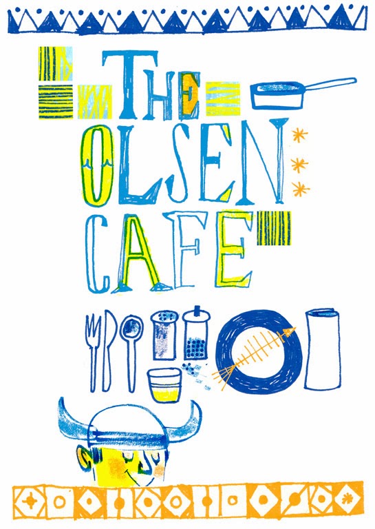
I worked on two fantastic projects last year that really stretched my lettering skills and gave me the chance to play with different ways of lettering as well as combining and fusing lettering with my illustration too. 
©Jill Calder 2013
The first project was the much publicised Little Black Book of Seafood, commissioned by the Leith Agency in Edinburgh (written about here). The second project was a monthly editorial for Reader's Digest USA for their legendary Word Power quiz. 
This how I described my competition entries for Word Power:
“Each month, two words, paired either with their correct meaning or a (believably) false definition, are selected from the multiple-choice Word Power quiz in Reader’s Digest, and illustrated using a whimsical blend of hand lettering and imagery with a limited color palette. The final pieces were spot illustrations, so they also needed to pack a punch visually.”

 I absolutely loved working on both these projects as they really stretched me, allowed me to experiment and try new things out with my lettering. Needless to say, the creatives who commissioned me - Andy Archer and Bob Lovie at The Leith Agency and Marti Golon at Reader's Digest - encouraged me but also trusted me enough to give me the space to do my thing. A sign of a good art director!
© Jill Calder 2013

So I entered both projects to the coveted Communication Arts 4th Typography Competition ( right on the deadline, as per usual) and expected nothing to come of it. So, imagine my surprise when I got the email from them to tell me that I had won not one but TWO Awards of Excellence for both these projects! Yes, I admit I did a little dance and the dogs got confused and started to bark.

Of the 1,498 entries submitted to this year's competition, only 152 were selected by a jury of respected creative professionals, representing the work of 132 type designers, hand-letterers, design firms, agencies, publishers and in-house creative departments.

All the winners are featured in the luscious Jan/Feb Typography Annual, which is OUT NOW  both in print and digital formats. 
Thank you CommArts!

© Jill Calder 2013


Friday, February 15, 2013

Little Black Book of Seafood


This was a dream illustration and lettering job that first landed on my desk almost a year ago, took a while to get going, then BAM! - it's everywhere now! Here's the story:


 The lovely and sassy team at The Leith (an Ad agency in Edinburgh who I have worked with many times before) got in touch to say their client, First Great Western, were collaborating with award winning chef Mitch Tonks to produce a guide to the best seafood restaurants, cafés and fish and chip bars in the South west of Britain...and would I like to illustrate it? Why, yes I would, thank you very much.

 Now, I love my seafood, love cooking seafood and I live in a fishing village so I felt very at home with this project - I just needed to look out my window for inspiration: Crab and lobster creels all stacked up, blokes fishing on Cellardyke Harbour (catching pollock), the prawn boats from Pittenweem out in all weather and the haddock on my plate at the Anstruther Fish Bar, served with a mug of strong tea.

I adore drawing foodie things and on this project I got a pretty free reign to produce imagery, maps, lettering and also a selection of wee line spot illustrations for the book. Heaven.
sketches... crammed in like sardines

As an added bonus, the book was animated for online viewing and you can see the whole thing HERE

Of course, First Great Western are promoting the book to inspire people to travel to Devon, Dorset, Cornwall and South Wales, explore the region and discover some fishy foodie gems tucked away down there in the Southwest. A culinary pilgrimage, if you like...with sporks.


Little Black Book of Seafood was launched at Paddington Station in London, where Mitch and fellow chef, Mark Hix created a pop-up dining room, offered oysters and fizz to rush hour commuters and had a good chat about how great the quality and range of seafood on offer in the Southwest is!
What I really like is that all proceeds from the sale of the book ( it costs £1.50) are donated to The Fishermen's Mission, a charity dedicated to helping the lives of fishermen and their families.


Enjoy the book and if you love a little bit of fishy in your dishy then please take a moment to donate to the Fishermen's Mission here
 Now, someone pass the tartare sauce, my chips are getting cold!


Saturday, January 12, 2013

Slàinte mhath! • [ slanj'-uh va' ]

...or, Benromach Single Malt Whisky ( no"e") and Me

Neil, David and Richard Urquhart of Gordon & MacPhail toasting Keith and Mike!
On a cold winter's day last year I was contacted by renaissance man Doug Alexander at Stuff Creative and asked if I fancied getting involved in a bit of branding for a small, exclusive single malt Scotch whisky distillery called Benromach.
Now, I have been involved with port, vodka and beer campaigns before but never a Scotch whisky, so of course I said YES. I am a Scottish illustrator after all and it's our national drink...I'd be daft not to!

Benromach, founded in 1898, is the smallest distillery in Speyside. 30 years ago the brand very nearly went extinct when the distillery was closed down. Rescue came from Elgin based bottlers and distillers Gordon & MacPhail who took it on and overhauled the  distillery buildings and stills in Forres and the distillery was finally officially reopened by HRH Prince Charles in 1998.
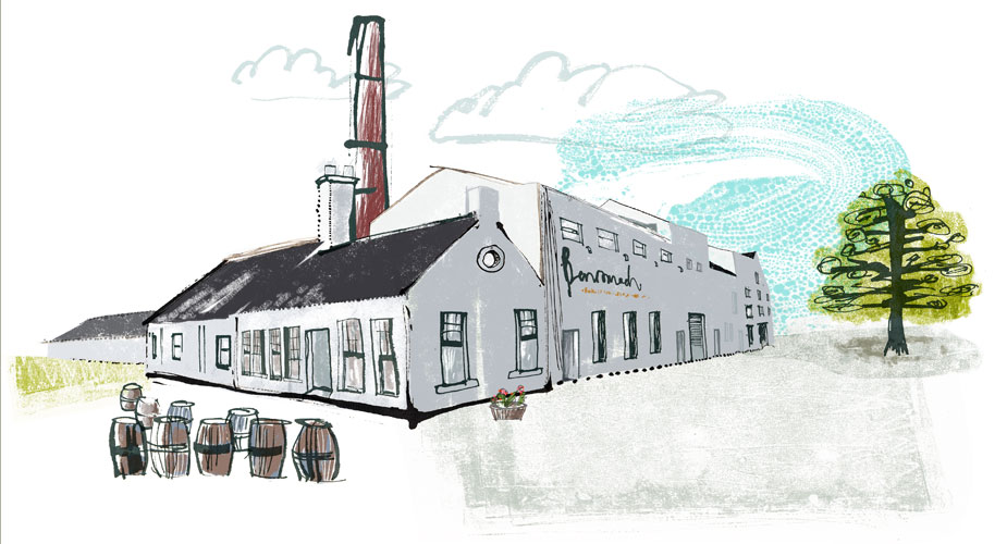
my illustration of the Benromach Distillery

Today just two ordinary (yet extraordinary), local blokes distill the Benromach whisky - no computers, no drama, nada. Just Keith and Mike, making lovely award winning water of life.
And it is this message that Stuff Creative and Gordon & MacPhail really wanted to tell people about the Benromach whisky:  that it's home made and hand crafted.
David Urquhart, Joint Managing Director of Gordon & MacPhail, the family-run Elgin company which owns Benromach commented: “Benromach is a handmade, boutique whisky which is lovingly crafted by Keith and Mike. They are the essence of Benromach and so we thought it appropriate that they were placed front and centre of our new concept."

Keith and Mike, with the whisky stills behind them.

 My illustration and lettering style and my way of working really chimed with this branding message and so I travelled up to the distillery in the north of Scotland one snowy day to meet Keith and Mike, have a blether, a few tastings and get shown around...and do some drawings of them in their place of work. What a pleasure!


I came away with lots of rum tales ( the distillery is haunted by a cat, apparently) and a great impression of how to portray them both in the illustrations I had been invited to do. How lovely to actually meet and talk to the subject of my illustrations face to face. Yes, I could have Googled them but my heading north really made a difference, I think, to the feel of the final illustrations.
The project continues - an animated film, and even a book have been discussed!
Whisky without an "e" is big business for Scotland right now... Benromach have just reported that their global sales increased by 40% in 2012 and exports increased by 55%. I like to think that my illustrations had a small part to play in that success!

Meanwhile, my illustrations of Keith and Mike now appear internationally on huge trade show and food festival backdrops and banners, in advertising spreads, on posters and even as life size cardboard cut outs that people have their photo taken with, dram in hand, toasting them with the traditional Scots Gaelic, Slàinte mhath! - pronounced slanj'-uh va' - meaning Good Health!

Keith at the Benromach stand at the Royal Highland Show 2012

Tuesday, July 12, 2011

Central Illustration Agency and Me...


Big Announcement, folks!
I am delighted and truly thrilled to be invited to be part of the mighty Central Illustration Agency, based in London, who will now represent my illustration and lettering work exclusively in the UK and Europe. Good, eh?

There is a wealth of mega talent currently repped by the CIA and I will be joining the likes of Sir Peter Blake, my hero David Hughes, the wondrous Sarah Coleman (aka Inkymole), cool dude Paul Wearing (a stablemate at Friend + Johnson too), my friend and colleague Jonathan Gibbs, lovely Wendy Plovmand...oh, the list goes on and reads like an Oscars roll call of top illustrators!

This is good for my business too: my American reps, Friend + Johnson, have been so busy getting me great jobs from across the Pond that I have had less and less time to attend to marketing myself here...criminal! As I said to Ben Cox, MD of the CIA, it was getting to the point where I either needed two of me or the services of a decent UK rep, so I am very glad he contacted me a couple of weeks ago to pop the question :-)
As I say to my students when they ask about finding a rep - the relationship works both ways and is very like a marriage: you have to be prepared to put work and ideas into it and to listen to reap the benefits. So, I am very much looking forward to this new working relationship and seeing what lies around the next corner!

I am passionate about the business side of illustration: all the marketing, promotion and negotiating fees...but having two heavyweight agencies looking after my interests allows my business to grow and I can concentrate on being creative!

So, hello CIA and all who sail in her...let's get ready to roll!

Monday, February 22, 2010

Ay! Cuba Libre Señorita!


It's gettin' hot and sassy in Promo-land, I can tell you!
Friend and Johnson, my lovely reps, are pairing their illustrators and photographers together in order to create a punchy series of double page ads in Luerzer's Archive magazine. The ads will also have tags that you can scan with your iPhone to take you direct to the F+J website - nice touch.
The wonderful Coco Connolly, a creative director from Minnesota who is designing the spreads decided my work would pair well (contrast well!) with that of Canadian photographer, Jock McDonald
Jock's beautifully punctuated picture of young Cuban boys standing on the sea wall acts as a quiet, profound partner to my brash, bold Cuban girl drinking a...Cuba Libre (Rum'n'Coke, silly).
My idea here was that somewhere behind where the boys were standing would be a wall covered with huge, faded and peeling advertising posters,including this Cuba Libre one.
Coco has added in some final flourishes to the spread, using parts of the lettering I created for it.
It was great to create a brand new piece of work for this - so much fun thinking about Cuban heat and music, whilst the snow and hail fell in chilly Scotland!

Tuesday, May 05, 2009

Lettering for Carte Blanche


Amongst all this museum work, I have also done a bit of logo work for my super talented friends Cait and Gibson at Carteblanche, who are specialists in distinctive decorative painting techniques. They do murals, graining, gilding, marbling - you name it! They also hold classes in both the UK and USA, which are very popular.
If you happen to be near Auchterarder, then drop into their brand new showroom and shop at 94 High Street!

Tuesday, September 11, 2007

Illustrophile


I got a lovely email yesterday from Charlene Chua, a Toronto based illustrator, who is also involved in the Illustrophile blog.
She has put up a little feature about me with links to my site - in particular the lettering I do. I was really chuffed - but more so because I had never heard of Illustrophile (I think it is new) and it is a wee cracker of a blog - as they say, it's an " illustration blog for lovers of all forms of illustration and commercial art"

There are LOADS of links to other illustrators, styles, interviews and other Illustration Associations - I'll need to get them to put up Scottish Illustrators too!
Related Posts with Thumbnails