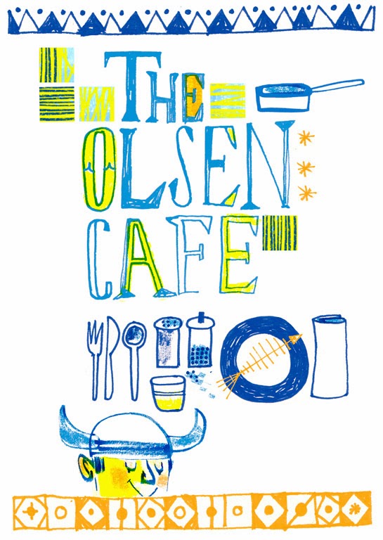
These days, there are quite a few competitions in the design world for us illustrators and hand letterers to enter and showcase our work and be judged by industry peers - some of them being serious industry heavyweights. A few of these competitions are the ones you *really* want to get somewhere in but often don't, as they are tough as old boots to make the grade in...Communication Arts is one of the big ones. Oh yes.
If I have a project I feel is strong enough, I enter it to either CommArts Illustration or Typography competitions and then usually hear nothing more about it!
Not this year though.
 |
| © Jill Calder 2013 |
 |
| ©Jill Calder 2013 |
This how I described my competition entries for Word Power:
“Each month, two words, paired either with their correct meaning or a (believably) false definition, are selected from the multiple-choice Word Power quiz in Reader’s Digest, and illustrated using a whimsical blend of hand lettering and imagery with a limited color palette. The final pieces were spot illustrations, so they also needed to pack a punch visually.”
I absolutely loved working on both these projects as they really stretched me, allowed me to experiment and try new things out with my lettering. Needless to say, the creatives who commissioned me - Andy Archer and Bob Lovie at The Leith Agency and Marti Golon at Reader's Digest - encouraged me but also trusted me enough to give me the space to do my thing. A sign of a good art director!
 |
| © Jill Calder 2013 |
So I entered both projects to the coveted Communication Arts 4th Typography Competition ( right on the deadline, as per usual) and expected nothing to come of it. So, imagine my surprise when I got the email from them to tell me that I had won not one but TWO Awards of Excellence for both these projects! Yes, I admit I did a little dance and the dogs got confused and started to bark.
Of the 1,498 entries submitted to this year's competition, only 152 were selected by a jury of respected creative professionals, representing the work of 132 type designers, hand-letterers, design firms, agencies, publishers and in-house creative departments.
All the winners are featured in the luscious Jan/Feb Typography Annual, which is OUT NOW both in print and digital formats.
Thank you CommArts!
Thank you CommArts!
 |
| © Jill Calder 2013 |


